Study and social space are merging
Read more
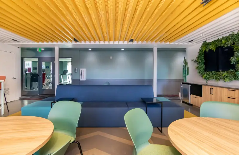
The older model separated a quiet study room from a loud lounge. Many newer projects instead plan a gradient: a social zone near the entry and coffee bar, semi-open tables where groups can work and talk, and enclosed rooms at the far end for focused work and calls. Students move along that gradient during an evening rather than choosing one room.
The design work is in the transitions. Glass partitions, changes in ceiling height, lighting levels and furniture type signal how loud each zone can be without signs. Acoustic absorption becomes more important as walls come down. A gradient that is not acoustically planned ends up loud everywhere.
Lighting supports the gradient. Brighter, cooler light over work tables and warmer, lower light in lounge areas tells students how a zone is meant to be used, and dimmable scenes let staff shift the whole floor for evening events.
Wellness built into ordinary rooms
Read more
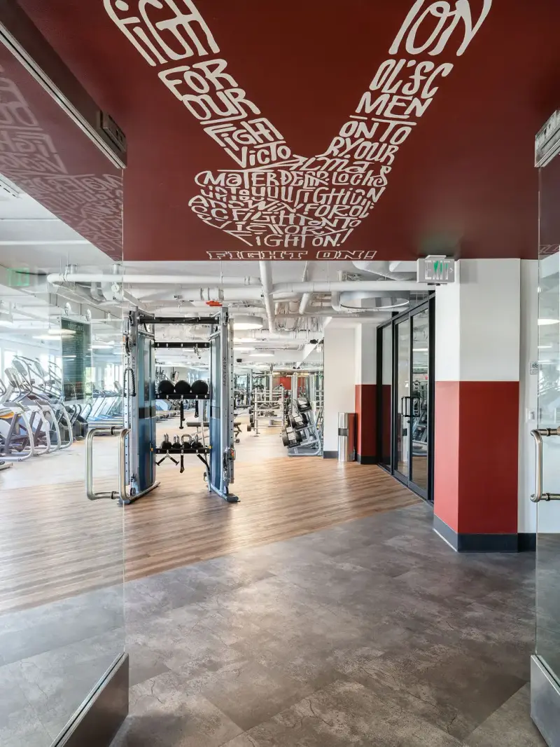
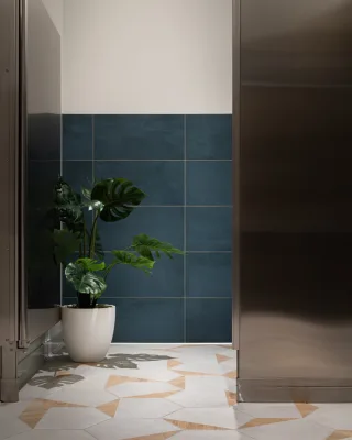
Wellness used to mean a gym and perhaps a yoga room. The current direction spreads it through the building: daylight and views from study and lounge seating, quiet corners off the main social areas, stretching or mat space beside fitness, plants and natural textures, and water refill stations.
This direction works when it is practical. A meditation room at the end of a corridor that nobody passes tends to become storage. A quiet nook visible from the lounge, with comfortable seating and soft lighting, tends to get used. Locate wellness elements on the routes students already take.
Wellness also reaches into units. Blackout window treatments for sleep, task lighting at desks, and layouts that keep the bed out of the main living area are small choices that residents notice every day.
Outdoor space treated as rooms
Read more
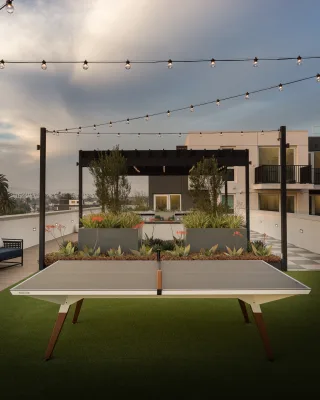
Courtyards, terraces and pool decks are being designed more like interior rooms, with zones for study, dining, grilling and lounging rather than a single field of loungers. Shade structures, outdoor-rated lighting, table height seating and, where the design allows, power make outdoor study possible.
Climate drives the details. Desert campuses need deep shade, heat-tolerant materials and furniture that does not get too hot to touch. Coastal and humid markets need fabrics and finishes that resist moisture and salt. The aim is the same in each: outdoor rooms that feel like part of the amenity floor, not a view from it.
Outdoor furniture should be heavy enough not to blow around or be carried off, and simple to hose down. Fixed tables with movable chairs are a common compromise, giving structure while letting students pull seats into the shade as the sun moves.
Content moments tied to real use
Read more
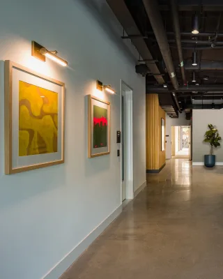
Students share their living spaces on social media, and properties benefit when those images are distinctive. The early approach was a mural or neon sign as a photo backdrop. The current direction ties the visual moment to a usable space: a bold wall behind a booth, a statement light fixture over a group table, or a colorful stair that people actually use.
This matters for durability and for honesty in marketing. A photo moment attached to a functional space keeps earning attention after opening, while a backdrop that interrupts circulation often gets furniture pushed in front of it.
Lighting is often the most effective tool here. A distinctive fixture, a lit niche or a backlit panel gives photos a focal point and costs less to refresh than a full wall finish when the property updates its look.
Durable natural materials over glossy finishes
Read more
Material palettes are moving toward wood tones, textured upholstery, stone-look surfaces, matte metals and warmer lighting, away from high-gloss surfaces that show every scratch. The reason is partly taste and partly practical: textured and natural-looking materials tend to hide wear better between turns.
The practical test is how a material looks at the end of its first year. Wood-look laminates and luxury vinyl, performance fabrics, solid surface counters and powder-coated metals are common choices because they combine a warm look with cleanability. Ask how each surface is repaired before approving it, since student housing turns most of its units in a short window between terms.
Flexible furniture with anchors
Read more
Shared spaces host studying, events, watch parties and tours, so flexible furniture is common. The design direction is toward flexibility with anchors: fixed booths, built-in benches and heavy communal tables that hold the layout, with lighter stools and side tables that move. Rooms planned this way still look organized after a busy weekend.
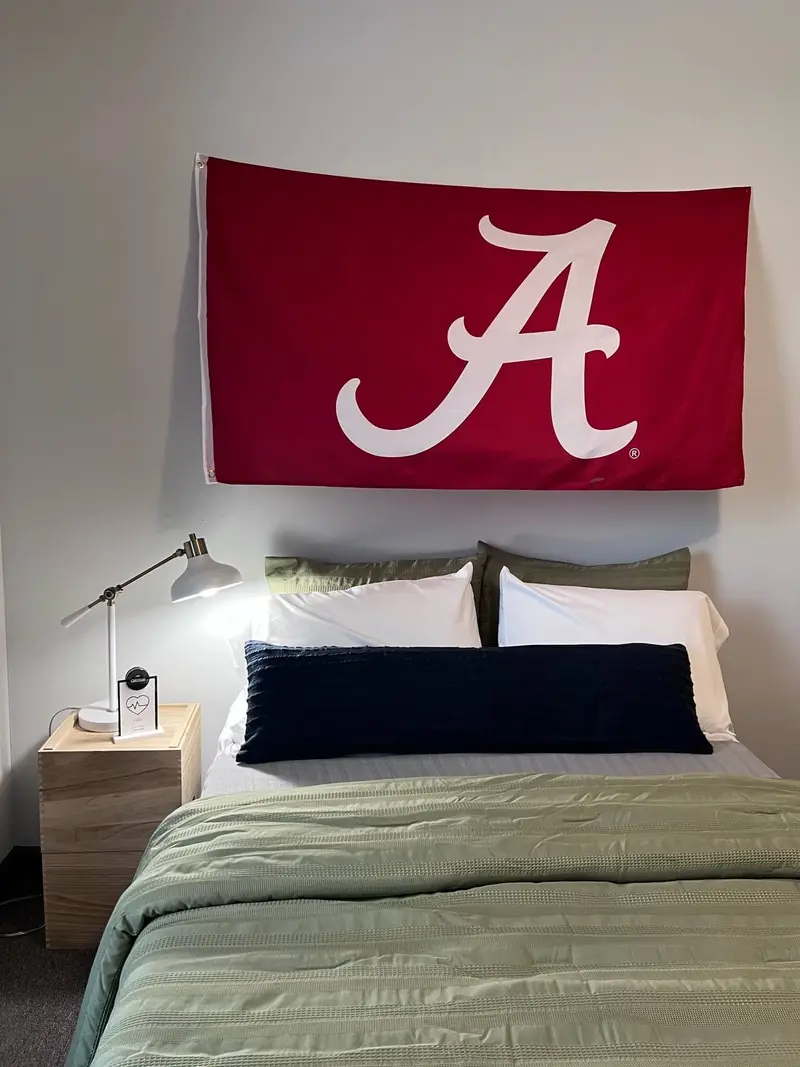
The same thinking applies inside units. Furniture packages are becoming more modular, with beds that adjust in height for storage underneath, desks sized for a laptop and a second screen, and seating that works for studying and socializing. Consistent models across the property make replacements faster.
Identity rooted in the campus town
Read more
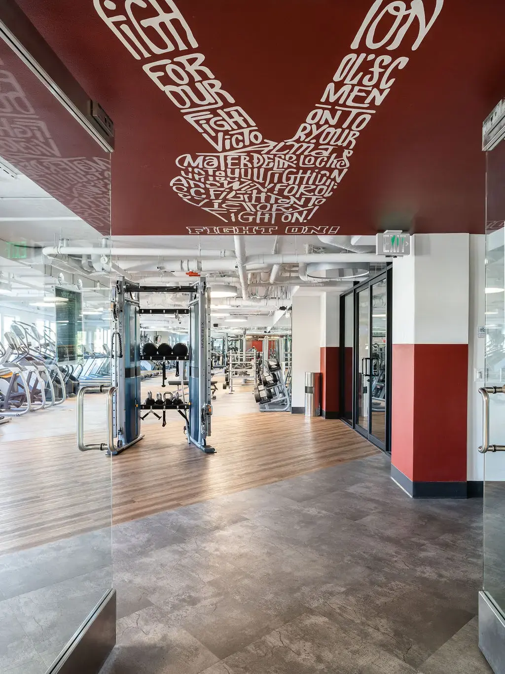
Properties near the same campus increasingly compete on character rather than amenity count. Designers are drawing on local architecture, landscape, color and history to give each building an identity that feels tied to its town rather than to a national template.
This is usually done through a few strong moves: a material or pattern that references the region, art from local artists, and a color palette drawn from the landscape. The rest of the design stays durable and calm. Heavy theming tends to age quickly, while a well-chosen local reference can last through several leasing seasons.
Identity also shows up in naming and graphics. Room names, wayfinding and signage that use local references carry the story through the building, and can be updated between leasing seasons more easily than finishes.
Our student living work
Read more
Level Up Interiors has completed student living projects including Urbane in Tucson, Arizona, West 27th in Los Angeles and East Edge in Tuscaloosa, Alabama. Photos are in the student living gallery.
By the Level Up Interiors team. Published 2026-10-10.