Storytelling aimed at one buyer
Read more
Generic staging is giving way to models merchandised for a specific buyer: a young family, a move-up household, a remote worker, a 55+ downsizer. The shift is in specificity. A secondary bedroom shows a teenager's room or a guest room for visiting grandchildren rather than a neutral bed and nightstand. A dining room is set for a weeknight dinner or for hosting, depending on who the community is selling to.
The limit is personality. Buyers need to imagine their own lives in the home, so the story should be readable without becoming someone else's house. Family photos, monogrammed items and heavily themed rooms usually go too far. Books, hobby equipment and a set table usually land.
Flex rooms with a clear job
Read more
Plans increasingly include a loft, den or bonus room labeled flex, and that label does not sell anything. A flex room furnished with a sofa and a console looks like leftover space. Builders are getting more value from giving each flex room one obvious use, such as an office, guest room, playroom, gym or media room, with a secondary hint of what else it could be. A playroom with a homework desk, or a guest room with a reading chair by the window, covers a second buyer without blurring the message.
The choice should come from the buyer profile and from the sales team's experience of what buyers in that market ask for. Different plans in the same community can show different uses, which also helps buyers remember which plan was which.
Working home offices and multigenerational suites
Read more
Remote and hybrid work made the home office something many buyers look for specifically, and a desk and chair in a corner no longer convince. Models now show a proper work setup: a full-size desk, task lighting, a background suitable for video calls, storage for files and a door that closes. Where a plan has two possible office locations, showing one as a shared workspace speaks to households where two people work from home.
More plans also include a ground-floor suite or separate living area for an aging parent, an adult child or long-term guests. Merchandising it well means showing that the space can stand on its own: a sitting area as well as a bed, a coffee station or kitchenette where the plan includes one, and a bathroom styled to show easy access without looking clinical. The buyer should be able to picture a relative living there comfortably, not just staying the weekend.
Both rooms reward honest scale. A desk that is too small or a suite furnished like a hotel room undersells the space the builder is paying to include.
Outdoor rooms furnished like interiors
Read more
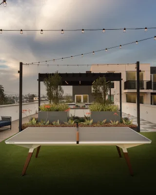
Covered patios, courtyards and balconies are now treated as rooms, and models show them that way. An outdoor dining table at full size, a lounge group, an outdoor rug and lighting make the space read as part of the floor area. An empty patio leaves buyers guessing about scale.
Outdoor selections have practical limits in a model. Cushions fade and collect dust, and someone has to maintain them through the sales period. Performance fabrics, furniture that can stay out in the weather and a clear maintenance plan with the sales team keep outdoor rooms presentable.
Warm minimal palettes and natural texture
Read more
The cool gray, high-contrast look has largely given way to warmer palettes: creamy whites, greige and taupe, wood tones, natural fibers and darker accents in metal or stone. Rooms are still uncluttered, but texture does the work that pattern and color used to, through boucle, linen, wool rugs, rattan, ceramics and wood grain.
This direction also helps reuse. Pieces with clean lines and adaptable color move more easily into the next community than strong statement pieces, while accessories and art can carry each community's character.
Layered lighting and art at the right scale
Read more
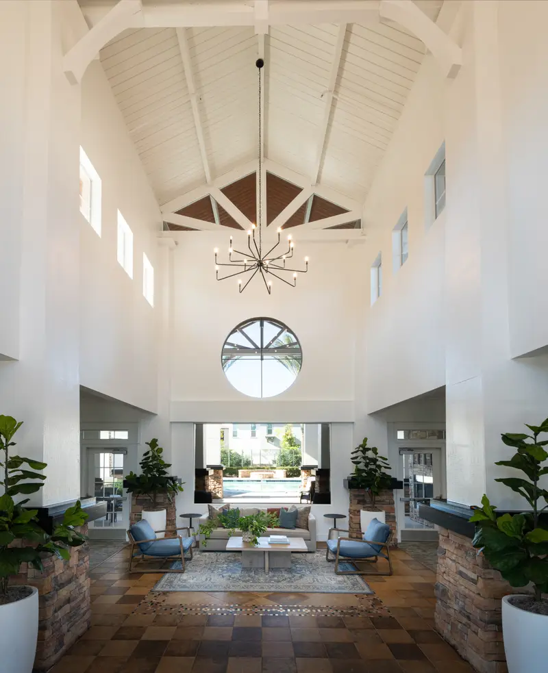
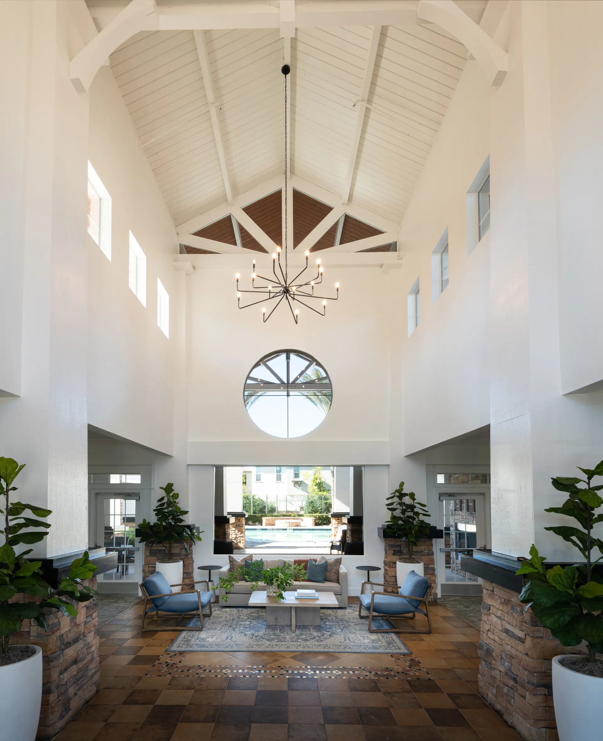
Lighting and art are where many models either come together or fall flat. Builders are moving away from relying on recessed cans alone and showing layered light: a statement fixture over the dining table, lamps in living areas and bedrooms, wall lights or picture lights in a hallway, and under-cabinet light in the kitchen. Lamps lit during tours make rooms feel occupied, especially on overcast days and late afternoons.
Art is getting larger and fewer. One oversized piece on a tall great room wall reads better than a cluster of small frames, and it helps buyers understand ceiling height. Smaller groupings still work in secondary rooms and hallways, where they make the space feel lived in. Original or textural pieces, such as canvas, fiber or ceramic work, photograph better than glossy prints that pick up glare.
Merchandising that supports option sales
Read more
Merchandising can make options and upgrades legible. Furniture placed around an upgraded island shows how it works for a family. A pendant over the dining table explains why the builder offers a lighting location there. Drapery on a sliding wall system shows that it can open fully. Closet systems styled with clothing show what the upgrade is for.
The sales team should know what each merchandising choice is meant to show, so they can point it out on the walkthrough. Coordinate with the builder's options list before selections are final, so the model does not display features buyers cannot purchase.
From the Elate program
Read more
Level Up Interiors completed the Elate model home program, a 55+ active adult community in Rancho Cucamonga, California. Builders comparing these directions against their own budget can use the model home budget article linked below as a companion.
By the Level Up Interiors team. Published 2026-10-10.